The Alms Group — Brand Collateral Redesign
CASE STUDY 04
Brand Identity
Print Design
Creative Direction
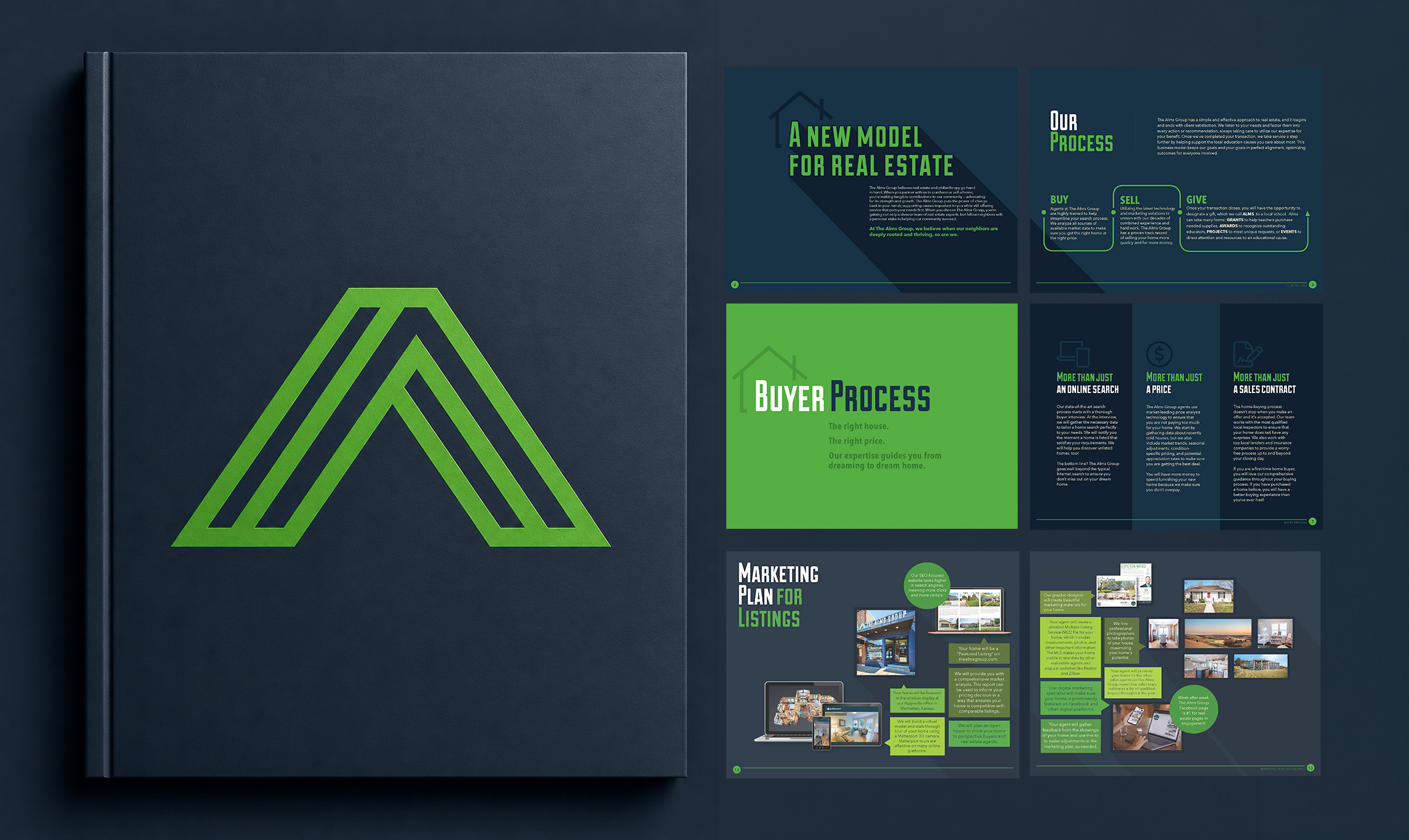
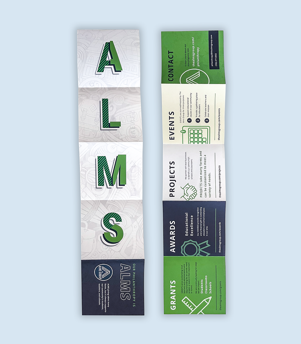
The Alms Group's existing print materials had a problem: they didn't look like they came from the same organization. Visually inconsistent and dated, the collateral undersold a sophisticated nonprofit at exactly the moments it mattered most, in front of donors and prospective clients. The project called for two distinct pieces serving two distinct audiences: a philanthropy-facing brochure for donor development, and a company profile brochure for potential clients. Same organization, different conversations.
The Brief
I owned this project from concept through production, handling creative direction, layout, and image direction. Before touching a layout, I addressed the root problem: there was no consistent visual foundation to build from. Establishing that foundation first meant both pieces could feel cohesive without feeling identical.
The philanthropy piece leaned into mission and emotional resonance, designed to build trust and connection with donors. The company profile prioritized clarity and credibility, designed to answer a prospective client's core question: why this organization? Each piece had its own job, but together they presented a unified, professional brand.
The Approach
The Alms Group went from materials that fragmented their brand to a suite that held together across every audience touchpoint, building credibility with donors and clients alike. As Director of Marketing during this period, I also drove a 35% increase in overall engagement and significant email performance lifts, reflecting the cumulative impact of bringing the organization's communications up to the level of its actual work.
The Result