Sunset Zoo — Wayfinding Map & Signage System
CASE STUDY 03
Environmental Design
Wayfinding
Visual Systems
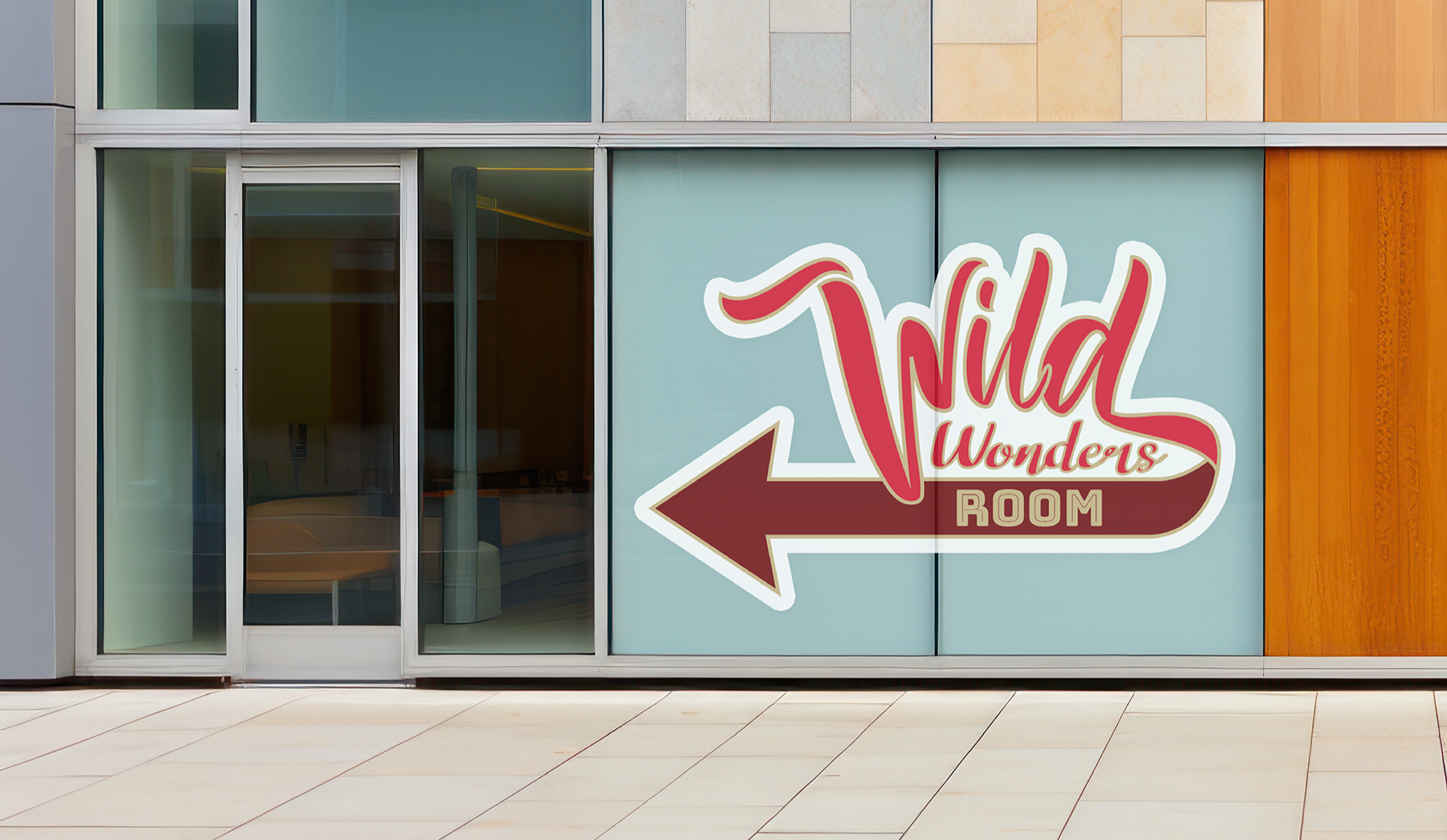
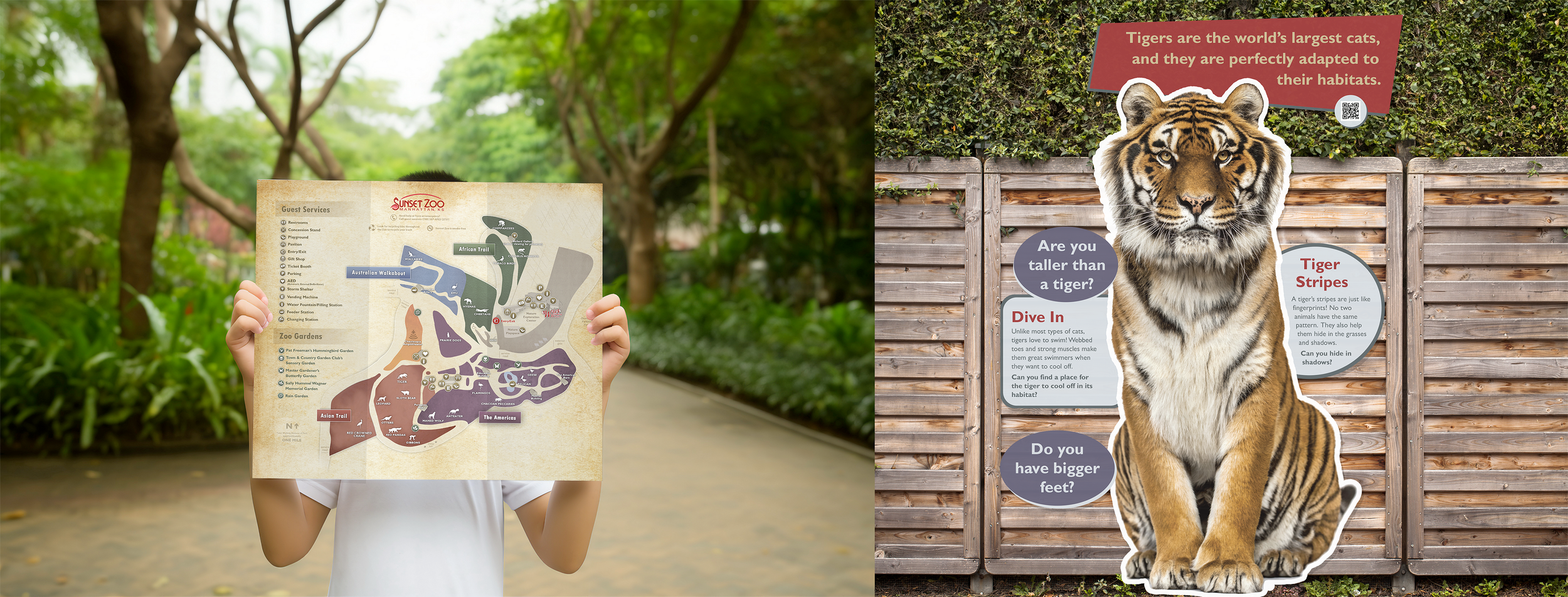
Sunset Zoo needed two things: a redesigned visitor map that better served guests navigating the space, and a brand-new signage system (directional and informational) built from scratch to work throughout the park.
The Brief
The core design challenge was consistency at scale. A signage system lives across dozens of applications including small directional signs, large exhibit panels, and printed maps, and has to read clearly at all of them. One system, many contexts.
I focused first on establishing a clear typographic hierarchy and layout logic that could flex across every sign type and size without losing legibility or visual cohesion. The rules I set at the start governed every decision downstream: what's a headline, what's a label, what's a descriptor, and how those elements scale and reposition depending on the format.
The map redesign layered on top of that foundation, updating the visual language to align with the new system while improving wayfinding clarity for visitors.
The Approach
Both the redesigned map and the full signage system were produced and implemented at Sunset Zoo. Guests now navigate with a cohesive visual experience from the moment they arrive. Environmental and wayfinding design is rare work — it has to hold up across dozens of formats and survive the gap between screen and physical space. This system does both.
The Result
Also for Sunset Zoo — Beyond wayfinding, the relationship extended to event graphics and seasonal programming: Earth Day campaigns, Brew at the Zoo branding, and additional environmental signage throughout the park.
RELATED WORK