Cura Insurance — Brand Identity & Website Redesign
CASE STUDY 05
Brand Identity
Web Design
Creative Direction
Cura Insurance came in with nothing. No logo, no colors, no visual language. Just a name, a location (Manhattan, KS), and a clear value proposition: an independent agency that shops dozens of carriers to find coverage that actually fits. The job was to build a brand from zero that could earn trust in a category where trust is everything.
The Brief
Cura Insurance launched with a cohesive brand that holds together from business card to website, with visual identity, tone, and positioning all aligned. The ongoing website redesign continues that work: taking a brand that was built right and building a digital experience that converts.
The Result




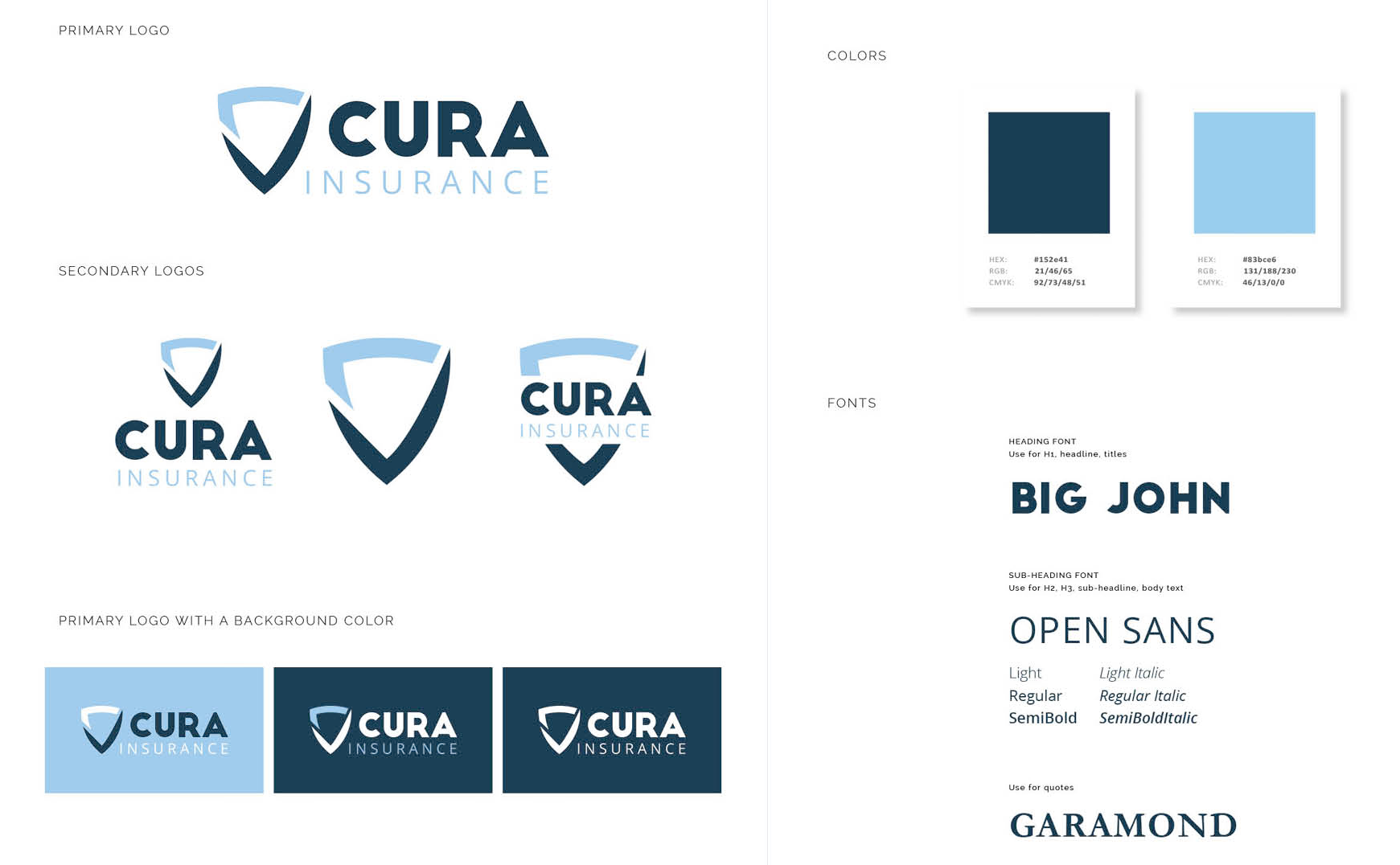
I built the full identity foundation first, including the logo and mark, color palette, typography, and brand guidelines, before anything else touched a screen. The palette anchors on deep navy and sky blue: professional and calm, but warmer than the corporate blues most insurance brands default to. Every decision was made with the same question in mind: does this feel like someone you'd call when something goes wrong?
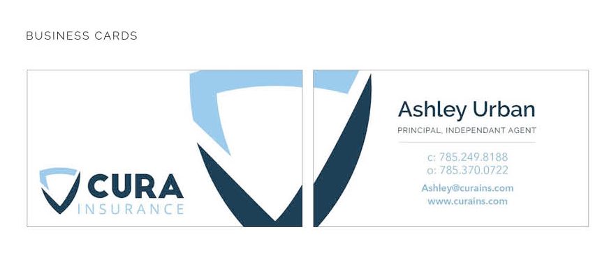
From there I designed and built the original website on that foundation, then developed marketing collateral that extended the system across print and digital touchpoints. The brand guidelines documented the rules so the identity could be applied consistently across any future channel or vendor.
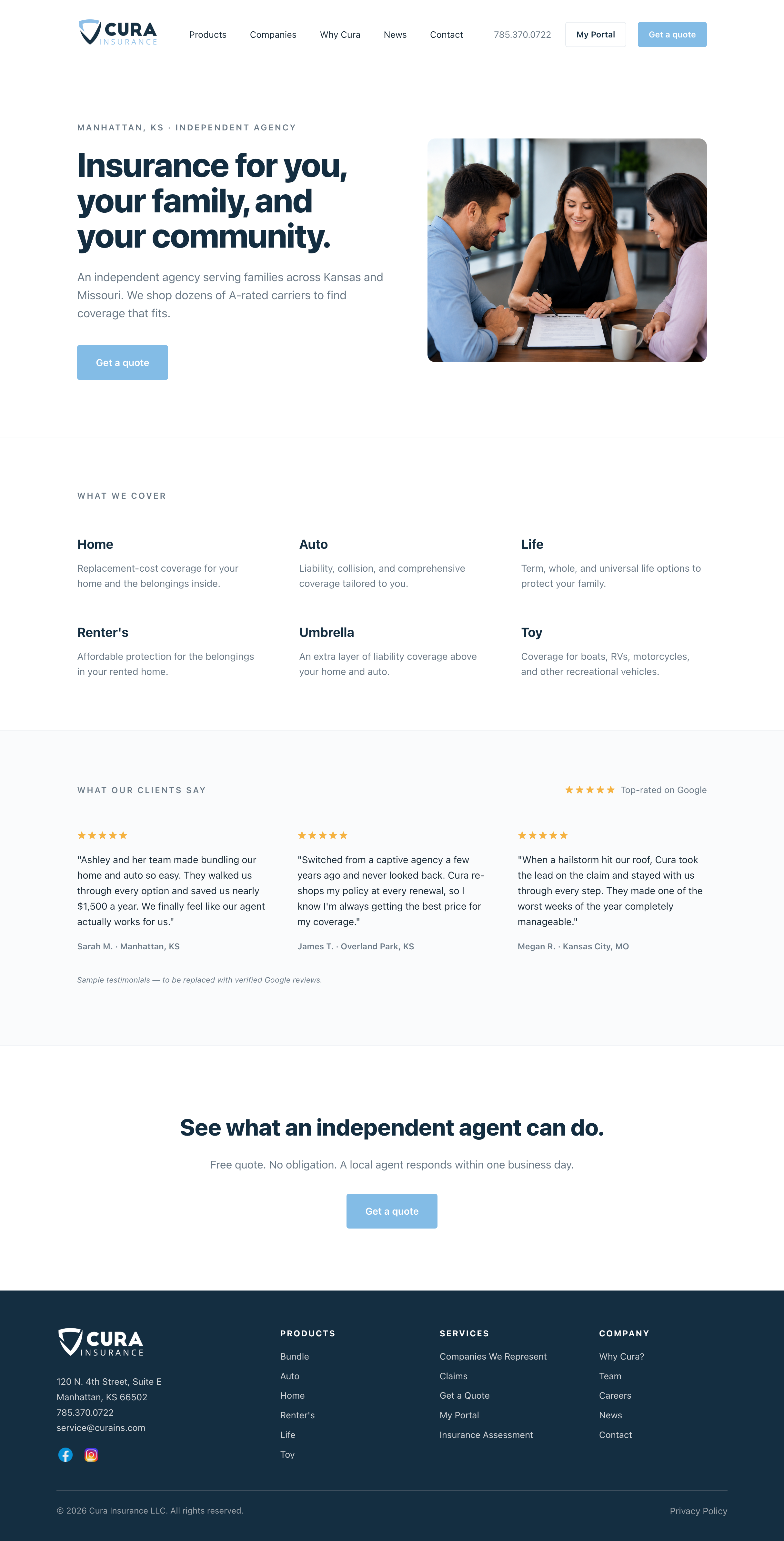
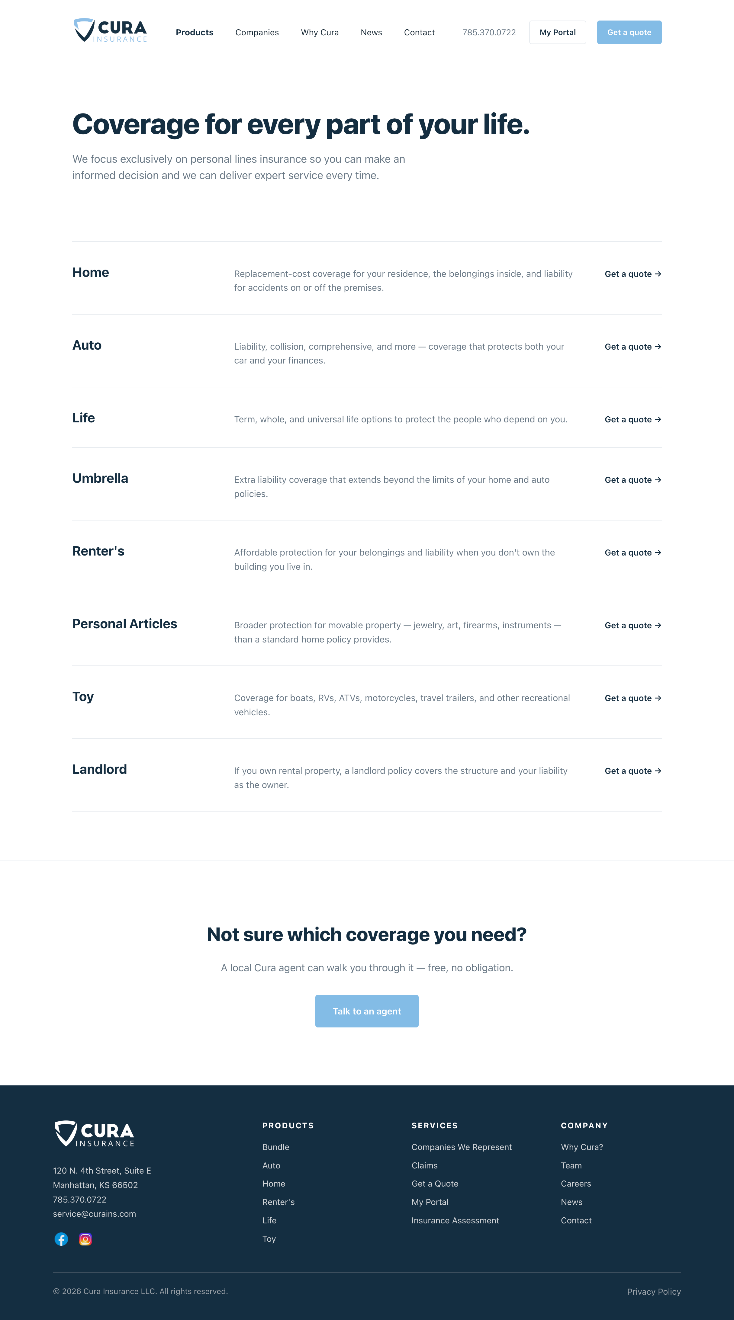
The site is currently being redesigned. The new version restructures the homepage around clearer product navigation, a stronger independent agency value proposition, and a streamlined path to quote. The redesign introduces a two-column hero that leads with the community angle, a clean six-product grid, a social proof section anchored by Google reviews, and a dark navy footer that organizes the full site architecture at a glance.
The Approach
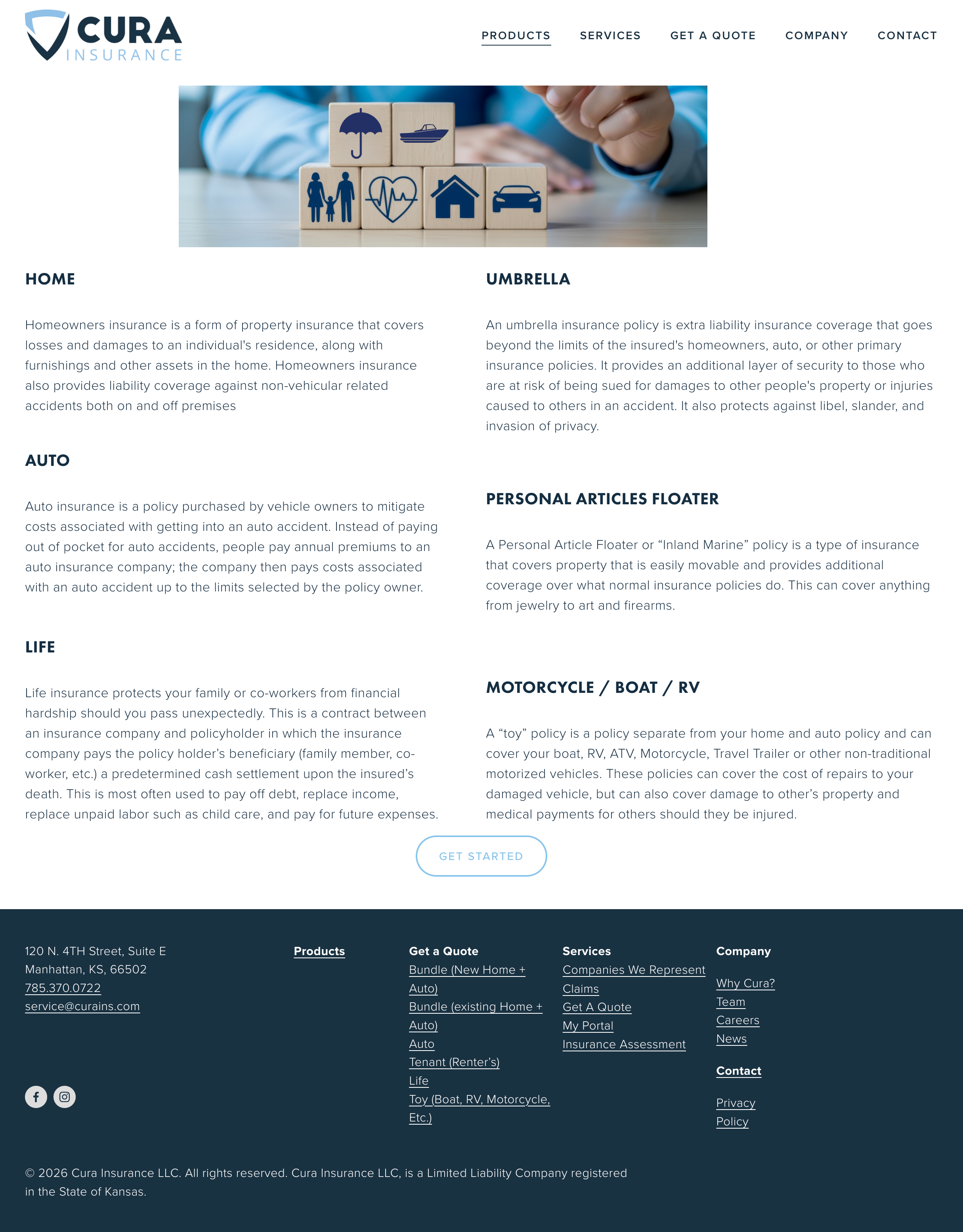
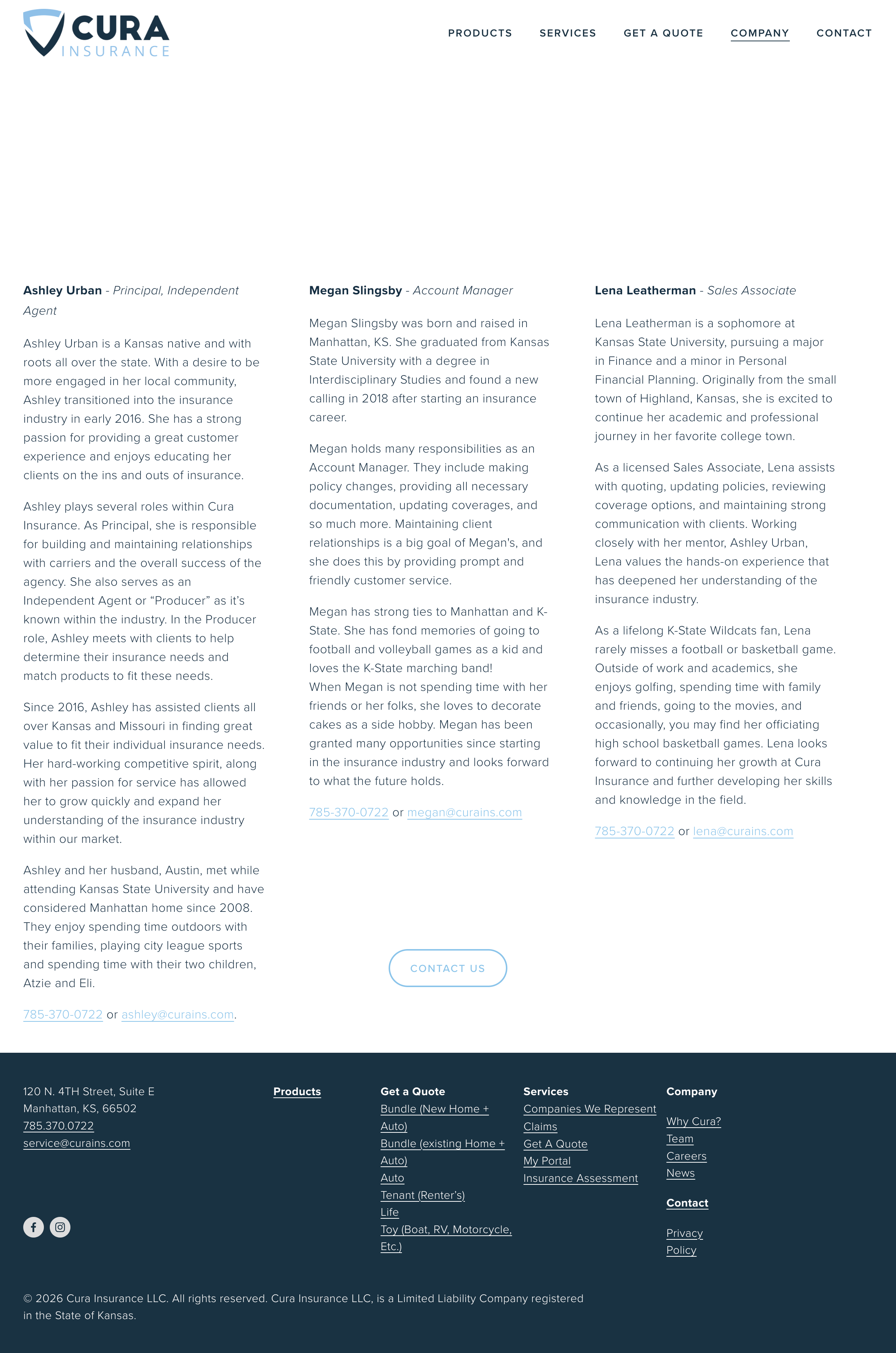
OLD WEBSITE

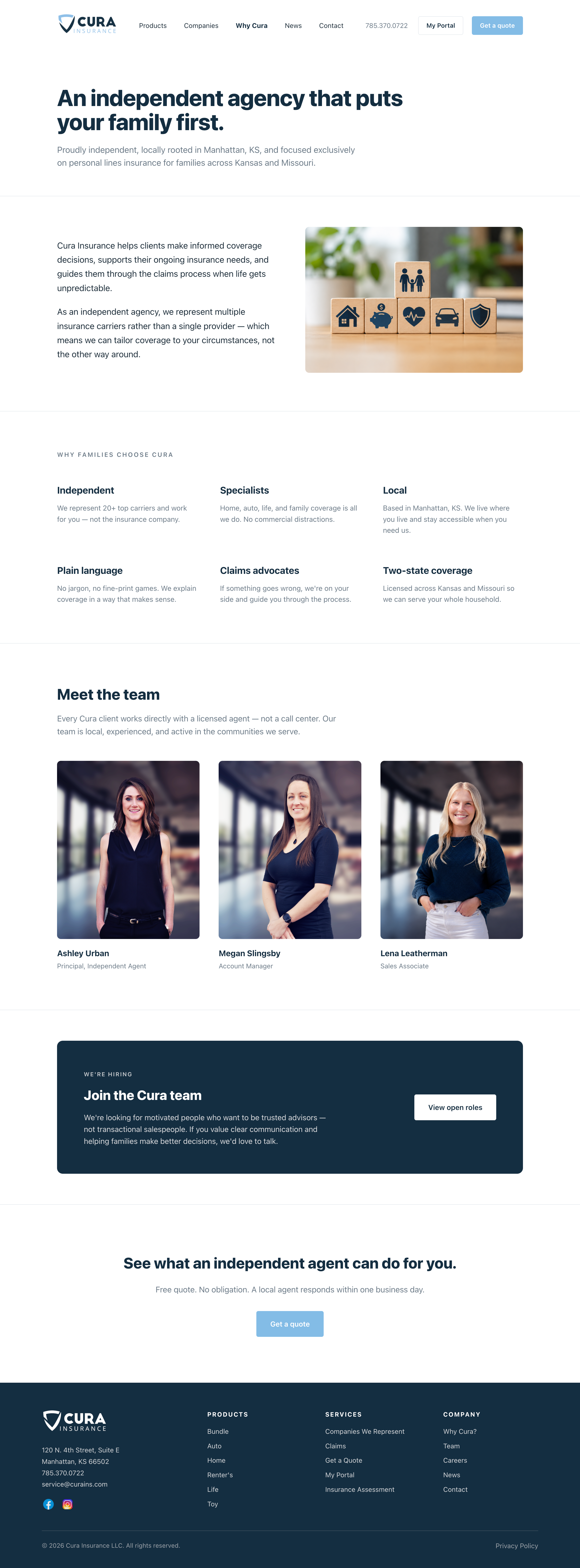
NEW WEBSITE